- http://www.trollop.com/
- Really not a fan of her work. Her photos are just photos that I've seen a million times all over the interent that could be taken by anyone with a camera. Her photogravure images remind me of images I made when I was messing around in photoshop for the first time, playing with the shitty filters.
- http://www.turtlesilk.com/
- I really enjoyed seeing her dog sketches. They're so adorable. I love how simple they are, yet totally capture the dog.
- http://www.preneo.org/nwylde/
- The structure of this site is a bit confusing. But I eventually found a link to Nanette Wylde's books! They're fantastic. I'm super impressed that she actually made a book with the flexagon method.
- http://www.tjreddickart.com/
- I was not surprised at all when I read that this artist was interested in skate art. They also are clearly interested in sharks, cats, and snarling animals. Eh...
- http://www.ghadaamer.com/
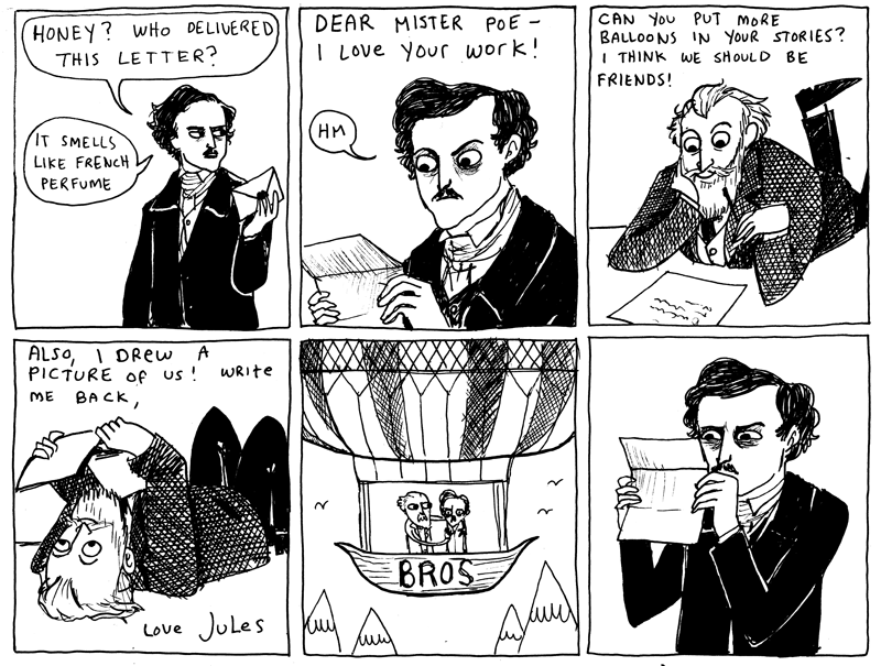
- Oh! We learned about this artist in our Art of the Book class! In fact I emailed Sheri this link. This artist is so great! Special thanks to Karen for telling us about her!
Wednesday, December 12, 2012
Sheri's Collection
The Center for Book Arts and IPCNY
This week the class went down to Chelsea.
We visited the Center for Book Arts, located at West 27th Street. This place is amazing! I'm so happy we went there. I really love book arts. Our tour guide was very informative. She ld us about all the programs available in the studio such as artist memberships, residencies, and studio rentals. They also have classes there that teach you about letterpress and various bookmaking techniques.
They have a really great show going on there as well. They had a bunch of prints and articles having to do with Occupy Wall Street. They also have an exhibition of the book artist Kumi Korf, who's work is really beautiful.
This is definitely a place I would like to visit again, and hopefully one day work in!


Our next stop was the International Print Center New York, or IPCNY, located at West 26th Street.

This was another great place. Unlike the previous stop, IPCNY is not a studio, just a gallery. Their current show is their New Prints 2012/Autumn show. The show was very well put together and included work of all types of printmaking. It's really amazing to see work from all over the world, from all different skill levels, all placed in one show.
That's the best thing about IPCNY. They accept applications from everyone for their shows, giving everyone an equal opportunity, which is hard to come by in the art world.
Wednesday, December 5, 2012
Rachel's Collection
This is definitely one of my favorite collections so far!

- http://redlandrambles.com/
- This site is really great! It's a little peak into Rachel's life and it's like a whole other world. I really enjoy reading the posts about all the different fruits that aren't native to NY.
- http://www.arthousecoop.com/
- The sketchbook project is actually a really cool idea. I would totally participate in it if it wasn't so expensive. I've seen other projects with the same concept going on, for free, somewhere on the internet, but I doubt they are as successful.
- http://www.ericvalli.com/
- I've seen Eric Valli's work floating around the internet for some time now. But, I still find his photos completely breathtaking. It's amazing how these people live in these super harsh environments such as the Himalayas and get by without the use of modern technology. In fact, I'm absolutely jealous of their capability to do so (and Eric's ability to have this amazing experience of having such a close view into their lives)
- http://kittiesandbullshit.com/
- Too good. This definitely ruined a few songs for me I think my favorite was the Biz Markie cat.

- http://theballetcats.com/
- This is really interesting to see after looking at Eric Valli's photos. So, I guess the cool thing now is to take pictures of "foreign" cultures. But I find myself not as drawn to these photos as opposed to Valli's. I guess it's the really shitty Urban Outfitters, Holga camera effects on every picture.
- http://www.thefeaturedcreature.com/
- This site was really cool. Until there were posts about TERRIFYING SPIDERS. NOPE. NO THANK YOU. definitely done with that site. I'll stick to cat pictures.
- www.wwoofusa.org
- Um, excuse me, this is awesome. I totally want to work on an organic farm! I'm very surprised that the closest one to my house is in New Rochelle, of all places.
Tuesday, December 4, 2012
Abby's Collection
Sorry for posting this so late!
- http://www.feministe.us/blog/
- This blog is super interesting. It's funny how when people think about feminists they always think that is just women interested in women problems. But it's really so much more than that, and this blog shows this perfectly.
- Lynd Ward's Frankenstein Illustrations
- Oh God. Theses are so beautiful. And they're all woodcuts. The images are so perfect for the story. I'm in love.
- Decompression in Comics
- While reading this, I couldn't help but think back to the class I was an assistant teacher in two summers ago; Comic Drawing. Many of the students in the class did a lot of decompression in their final comics. So for me, it was interesting to read that this is a big trend going on right now in the comic world, and not just students ages 10-18.
Bettina's Collection
Again, this is a super long collection, so I'll just write about certain links that get a reaction out of me.
- http://losmuroshablan.wordpress.com/artistas/
- Even though it's written in spanish, they have some really beautiful work. It's really interesting how long murals have been a part of of spanish-speaking culture.
- http://sofiamaldonado.com/
- I'm not a huge fan of all of her work, but I really enjoyed seeing her murals that were more abstracted. For example, LA COMERCIAL and her mural in Gowanus.
- http://www.la-pandilla.com/
- For some reason I'm not too fond of this work. I love super detailed drawings of animals and everything, but something just isn't doing it for me here. Maybe it's the combination of different animals.
- http://www.whokilledbambi.co.uk/
- I just want to point out how awful the layout of this website is. Seriously, it's terrible. And it seems like a collection of work and various things for/from very angsty people.
- Resurrection of Diner
- So I'm very upset about this. After the Book Fair, I was standing outside of this place and didn't know anything was special about it. If I knew I definitely would have gone in to eat!
- Aliene de Souza Howell
- I'm in love with this installation. Her illustrations are beautiful and the way she created depth and space on the flat wall is amazing.
Monday, December 3, 2012
Elena's Collection
This is a really long collection, so I'm just going to write about what really caught my attention
- The Finer Points of David Rees
- I really can't tell if this is serious or not. If it's not then I applaud him. If it is, he needs to get over himself. They're just pencils. Stop it.
But from 9:50 on was actually pretty funny. I usually use mechanical pencils so he would hate me. - Green Mile Experiment
- This is really interesting! I personally would never be able to watch a movie without actually watching the movie. But I constantly watch movies without any background knowledge. It make it more interesting.
- Art Genome Project
- This is so cool. I'm constantly using pandora and looking at art blogs. So naturally I would want to combine the two. I'm currently waiting for my invitation to Art.sy. I really hope it is as cool as I think it is!
- http://www.mcbess.com/
- His work is fantastic. I love it!
- Lil Bub
- I'm really happy that my grumpy cat link started a cat trend. Lil Bub is my second favorite cat on the internet. I love his face. I had a picture of him as my desktop for like a month.

Tova's Collection
This collection was pretty interesting. There was a lot about Israel, but I haven't read an article that isn't partial to one side of the war going on, so I have yet to make a decision about that topic. With that said, I'm going to leave that out of this post.
- Hostess
- I'm really not a huge fan of Hostess snacks, I find them too sweet. But every now any then, actually more like maybe once a year, I'll eat maybe one of those disgustingly orange cupcakes and hate myself after it. But it is pretty sad that they stopped production. Now what are we going to eat after the end of the world?!
- http://www.josephbau.com/
- Not a huge fan of this type of work. After growing up going to synagogue and going to hebrew school, I'm really turned off by all of this. But it is a great example of this type of work.
- Denver Print
- I'm not really sure what I'm supposed to be looking at here. It's just a list of exhibitions that I can't go to because it's in Denver.
- Banksy
- A classic. Everyone knows about him and either loves or hates him. Why bother putting him in your collection.
- http://endless-swarm.com/
- Gross. Bugs. Ew :( I really could have done without this.
Kristian's Collection
It was really refreshing to see a collection that had pretty much nothing to do with art.
- Chronocolor
- I REALLY want to see this. I need to find a link of it streaming somewhere, or get my hands on it some other way. I don't care how, I just want to watch it!
- Georgia O'Keeffe
- Again, I really want to see this! Maybe I'll get the guts to drive to/in NJ to see it... maybe...
- http://www.ohmyrockness.com/
- This is great! I like how they don't just have big name shows on the front page and you don't have to dig around for lesser known bands. Now all I need is money to go to some of these
- Feliz Navidad!
- Oh my God. This is too great. The longer you watch it the funnier it gets. I love this. Best link given in any collection!
Lower East Side Printshop and Dieu Donné
The class finally met again for the first time in about a month. Between Hurricane Sandy and the Nor'easter, this whole semester has been a giant mess. Every class is scrambling to get work done, and it really isn't working out and just causing tons of unnecessary stress for both professors and students. So it's really great that this terrible semester is almost over...
So for our first trip in ages, the class stayed in Manhattan.
We visited the Lower East Side Printshop, which is lovated on W 37th St. and 8th Ave.

This printshop is a really great resource for everyone! Whether you're an just out of school trying to find a place to work, or a well established artist wanting to make some prints for the first time, you're welcome here. The shop also has a great residency program, where 10 applicants become key-holders for a year!
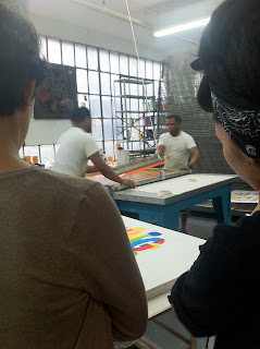
Our tour guide was extremely friendly and welcoming to the class. We started the tour in the great public work space, where you can rent time to work. They have a huge amount of resources available. 24/7 access to the darkroom, solvent room, and of course the work studio, with two beautiful etching presses.
They also do contract printing. This is where we met the master printers of the shop. Both of them were willing to talk to the class about their experiences of working in printshops, or putting up dry wall. They told us how they came to have the title "master printer", which seemed to be by accident for both of them.

Our next destination was one block away, on W 36th St and 8th Ave.
This was Dieu Donne, a paper making studio. It was so interesting to see an actual paper making studio! I have never had any interest in taking the school's paper making class due to the fact that it more sculptural based. But, if it was like what was going on at Dieu Donne I would definitely rethink that decision.
Our tour guide was an intern at the studio. He said this was his first tour ever, and it showed. This had to be our fastest visit ever! I'm still not really sure how anything really happens in that shop. Do they have residencies? Do people rent time to work there? I have no idea.
But, they did seem to make some beautiful work there. While showing the class the studio's portfolio, they had a beautiful watermark piece from Chuck Close. I don't really know who any of the other artists he showed were, but trust me, they were nice.


So for our first trip in ages, the class stayed in Manhattan.
We visited the Lower East Side Printshop, which is lovated on W 37th St. and 8th Ave.

This printshop is a really great resource for everyone! Whether you're an just out of school trying to find a place to work, or a well established artist wanting to make some prints for the first time, you're welcome here. The shop also has a great residency program, where 10 applicants become key-holders for a year!
Our tour guide was extremely friendly and welcoming to the class. We started the tour in the great public work space, where you can rent time to work. They have a huge amount of resources available. 24/7 access to the darkroom, solvent room, and of course the work studio, with two beautiful etching presses.
They also do contract printing. This is where we met the master printers of the shop. Both of them were willing to talk to the class about their experiences of working in printshops, or putting up dry wall. They told us how they came to have the title "master printer", which seemed to be by accident for both of them.

We got to see some prints that were made in their shop.
Our next destination was one block away, on W 36th St and 8th Ave.
This was Dieu Donne, a paper making studio. It was so interesting to see an actual paper making studio! I have never had any interest in taking the school's paper making class due to the fact that it more sculptural based. But, if it was like what was going on at Dieu Donne I would definitely rethink that decision.
Our tour guide was an intern at the studio. He said this was his first tour ever, and it showed. This had to be our fastest visit ever! I'm still not really sure how anything really happens in that shop. Do they have residencies? Do people rent time to work there? I have no idea.
But, they did seem to make some beautiful work there. While showing the class the studio's portfolio, they had a beautiful watermark piece from Chuck Close. I don't really know who any of the other artists he showed were, but trust me, they were nice.

Chuck Close it that grey one in the back

They also had some paper they made for sale. It was really nice paper, but for $20 a sheet, I passed.
Sunday, November 25, 2012
Zane's Collection
This is another collection that I never received.
The few things I enjoyed:
The few things I enjoyed:
- Clothing Of The Future
- This video is amazing. It's funny to see how close they were with some of the styles. For example the fishnet dress and those heels.
- 36th Street Subway
- This was so funny to watch. I want to go there just to see if I would be one of the one to trip. They should totally make a live stream of it with a trip counter.
Alyssa's Collection
I never received this collection when it was first sent out, so I had no idea it existed until I was creeping on my classmate's blog.
This collection made me laugh, because it is so obviously Alyssa's. Here's a few things that stood out to me:
This collection made me laugh, because it is so obviously Alyssa's. Here's a few things that stood out to me:
- http://ricksginjoint.tumblr.
com/ and http://ofanotherfashion. tumblr.com/ - These blog have some great old pictures. But it does get old really fast. Maybe that only because I see these pictures and many others on my tumblr dashboard all the time.
- http://shopoddities.tumblr.
com/tagged/medical - Can I please just have all of the things this blog posts? Except for the fake eyes, those kind of gross me out...
- http://www.fxwarehouse.info/
- This site is amazing! I've been looking for something like this for a while. I don't know what to order first!
- Makeup tutorial
- There are definitely better makeup tutorials available on youtube. I really don't get the whole interest in changing your lip shape.
- Marlon Brando
- swoooooooooon.
Wednesday, November 14, 2012
Jacqueline's Collection
- http://santani.deviantart.com/
- This artist makes some really beautiful dolls. I've always wanted to learn how to make dolls like this, but, I'm incompetent when it comes to sewing anything more than a few stitches. So, I really admire who ever has the skill and patience to make these
- Adventures with Ziggy
- Ok, so I completely understand having a fan blog for anything. I also completely understand weird obessions, But, I think this girl takes it to an extreme. She actually carries this doll around places, like work, and takes pictures with it. Also, the picture of the doll in the car... with a seatbelt on... really?
- http://www.harkavagrant.com/
- This is definitely one of my favorite web comics. I think my all time favorite is Poe and Verne.
The personalities for both authors are spot on and the situation is just ridiculous.
Monday, October 22, 2012
Booklyn, Kerry Downey, Heliopolis
Last week, The class took a trip down to Greenpoint, Brooklyn and visited two very different studios. and a gallery put together by my professor.
The first studio we went to was the studio of a really great organization called Booklyn. This group has over 500 members and counting. The organization helps artists all over the world create publications, cataloging them, and finding ways of getting the work out to the public. They have many gallery shows in their space in Greenpoint as well as around the world at book fairs, craft fairs, art shows, and even in libraries and museums.
Our tour guide was really great. I don't remember her name but she was hilarious and so down to earth. She told us the history of Booklyn and how she reluctantly became the person in charge of going to museums and libraries to try and sell different books. I loved her attitude towards us, she spoke to us as equals and was just bullshitting with us at the end of the visit. She also told us to get a day job that won't interfere with out art making (if anything it should help with it!).


A few blocks away was the studio of Kerry Downey. This was a very interesting artist to visit. Unlike many of the artists that we have spoken to, Downey never plans on selling any of her work.

This seemed crazy! One of the many topics of this class has been how to find a way to make a living from your work. Instead, she makes her living by teaching. She said it was probably because she gets too attached to what she makes. It was kind of refreshing to hear. I really relate to her because of that. I have a really hard time detaching from a piece I spent forever working on just for someone to hopefully hang it on their wall to look at occasionally.
It is very easy to understand why she would be so attached to every drawing or print she makes. A lot of what she does deals with very personal issues, such as phantom limb. Her work also deals a lot with the idea of failure and elderly people. She explained that she grew up in Florida and has been surrounded by and working with elderly since high school. Most of her work stems from an obsession with self help magazines trying to sell you mostly junk that you really don't need and a few things that might be helpful to a handful of people. So, there is a strange humor in all of her work that I really enjoyed.


Basically around the corner was a gallery called Heliopolis. The show that was currently there was put together by my professor, Bill. The show consisted of proofs, works that didn't actually work, notes, and other forms of planning. It was a really interesting show. I was very surprised by the fact that if I wasn't told what the show was about, I would have just guessed that everything was a final, well thought out piece.
The first studio we went to was the studio of a really great organization called Booklyn. This group has over 500 members and counting. The organization helps artists all over the world create publications, cataloging them, and finding ways of getting the work out to the public. They have many gallery shows in their space in Greenpoint as well as around the world at book fairs, craft fairs, art shows, and even in libraries and museums.
Our tour guide was really great. I don't remember her name but she was hilarious and so down to earth. She told us the history of Booklyn and how she reluctantly became the person in charge of going to museums and libraries to try and sell different books. I loved her attitude towards us, she spoke to us as equals and was just bullshitting with us at the end of the visit. She also told us to get a day job that won't interfere with out art making (if anything it should help with it!).

So many books!

View from a window in Booklyn's studio
A few blocks away was the studio of Kerry Downey. This was a very interesting artist to visit. Unlike many of the artists that we have spoken to, Downey never plans on selling any of her work.

It is very easy to understand why she would be so attached to every drawing or print she makes. A lot of what she does deals with very personal issues, such as phantom limb. Her work also deals a lot with the idea of failure and elderly people. She explained that she grew up in Florida and has been surrounded by and working with elderly since high school. Most of her work stems from an obsession with self help magazines trying to sell you mostly junk that you really don't need and a few things that might be helpful to a handful of people. So, there is a strange humor in all of her work that I really enjoyed.


Her deck had a beautiful view!

Some of Downey's work.
Basically around the corner was a gallery called Heliopolis. The show that was currently there was put together by my professor, Bill. The show consisted of proofs, works that didn't actually work, notes, and other forms of planning. It was a really interesting show. I was very surprised by the fact that if I wasn't told what the show was about, I would have just guessed that everything was a final, well thought out piece.
Wednesday, October 17, 2012
The Whitney Museum of American Art, The Metropolitan Museum of Art
Last week the class went to the upper east side and visited two art museums.
The first museum we visited was the Whitney Museum of American Art. There we went to one of their new exhibitions of the artist Wade Guyton. Personally, I really wasn't a fan of this show. After our small class discussion after seeing it, I could totally understand why other classmates enjoyed it. But it didn't do anything for me. While walking through the exhibition, I was really trying to like Guyton's work, but found myself saying "oh, here's some more stripes on a huge canvas... oh and some more circles... ok." Although I didn't enjoy the work there, I did appreciate the thought and process behind it. The only thing that actually sparked my interest was how he managed to put this huge piece of plywood into an inkjet printer to print on it.
I thought the exhibition was laid out well. As my professor had mentioned, you look through it the same way a printer head moves. I thought that was pretty clever. Yet, there was a few things in the exhibition that caused me to as "what? why??" There was a huge pile of found wood just propped against a wall in the first room. Apparently Guyton just flipped the pile... There was another moment that really didn't fit. There was a wall with just two digital photographs of the inside of a cave. There was no description of them or really any reason for them to be there at all.


The second museum we visited was my personal favorite, the Metropolitan Museum of Art. We saw a great exhibition called: Regarding Warhol: Sixty Artists, Fifty Years. I'm not a huge fan of Warhol. But this exhibition allowed me to see prints that I've never seen before. The show also consisted of contemporaries to Warhol and other artists that he influenced. There was work by Jeff Koons, Kelley Walker, Cindy Sherman, and Chuck Close to name a few. I was extremely happy to see the Chuck Close painting, "Phil" in person, I think I stood infront of it for like ten minutes, just staring at it. It was a huge, slightly over whelming show, yet it was very well put together. But I expect nothing but the best from the Met!
The exhibition was really fun to go to. There was a pile of candy for the audience to eat (there was actually a darker undertone to it - every piece of candy that was taken was representing the closer to death a person was getting), there was a room of tv screens showing clouds from Super Mario, and a room playing the velvet underground full of balloons we got to hit. The guard looked like he really enjoyed himself in the balloon room. But aside from how fun it was, it was really amazing to see how many people Warhol influenced, during his lifetime, while still making art, and after his death.
After seeing the Warhol show, I went to the European painting wing of the museum. The contrast between the work was amazing. I'm still more envious of the 16th century European painters than I am of anyone in the Warhol show.


The first museum we visited was the Whitney Museum of American Art. There we went to one of their new exhibitions of the artist Wade Guyton. Personally, I really wasn't a fan of this show. After our small class discussion after seeing it, I could totally understand why other classmates enjoyed it. But it didn't do anything for me. While walking through the exhibition, I was really trying to like Guyton's work, but found myself saying "oh, here's some more stripes on a huge canvas... oh and some more circles... ok." Although I didn't enjoy the work there, I did appreciate the thought and process behind it. The only thing that actually sparked my interest was how he managed to put this huge piece of plywood into an inkjet printer to print on it.
I thought the exhibition was laid out well. As my professor had mentioned, you look through it the same way a printer head moves. I thought that was pretty clever. Yet, there was a few things in the exhibition that caused me to as "what? why??" There was a huge pile of found wood just propped against a wall in the first room. Apparently Guyton just flipped the pile... There was another moment that really didn't fit. There was a wall with just two digital photographs of the inside of a cave. There was no description of them or really any reason for them to be there at all.


I managed to get these two pictures before getting yelled at.
The second museum we visited was my personal favorite, the Metropolitan Museum of Art. We saw a great exhibition called: Regarding Warhol: Sixty Artists, Fifty Years. I'm not a huge fan of Warhol. But this exhibition allowed me to see prints that I've never seen before. The show also consisted of contemporaries to Warhol and other artists that he influenced. There was work by Jeff Koons, Kelley Walker, Cindy Sherman, and Chuck Close to name a few. I was extremely happy to see the Chuck Close painting, "Phil" in person, I think I stood infront of it for like ten minutes, just staring at it. It was a huge, slightly over whelming show, yet it was very well put together. But I expect nothing but the best from the Met!
The exhibition was really fun to go to. There was a pile of candy for the audience to eat (there was actually a darker undertone to it - every piece of candy that was taken was representing the closer to death a person was getting), there was a room of tv screens showing clouds from Super Mario, and a room playing the velvet underground full of balloons we got to hit. The guard looked like he really enjoyed himself in the balloon room. But aside from how fun it was, it was really amazing to see how many people Warhol influenced, during his lifetime, while still making art, and after his death.
After seeing the Warhol show, I went to the European painting wing of the museum. The contrast between the work was amazing. I'm still more envious of the 16th century European painters than I am of anyone in the Warhol show.


Since I wasn't allowed any picture in the Warhol exhibition, have some 16th century European paintings.
Monday, October 15, 2012
Paul Ramirez Jonas, Gowanus Studio Space, Axelle Editions
Sorry for the late blog post! I was computerless for a good portion of last week (apparently Mac's aren't as reliable as I thought.)
Two weeks ago (10/4) the class went to Gowanus, Brooklyn. I heard awful things about this part of Brooklyn; my brother had been working with the D.E.P. to try and clean up the Gowanus Canal. But, I really didn't think it was that terrible.
So our first stop was the studio of Paul Ramirez Jonas. Although Jonas is not a printmaker, he does work with the idea of multiples and "easily accessible" art. These themes are a very common thing to come up in a discussion about printmaking. All of his work that he showed to us deals with interaction., whether it be between the artists and audience, two member of the audience, or the audience and art. I found that particularly interesting because I never really think of the audience that much when I'm working on a piece.
One of his works I particularly enjoyed was a piece where one person was given a key to the city. Along with the key, the person got a book that showed them where to go and what the key opened, such as a mailbox, cemetery gates, a secret garden, and many other things in all 5 boroughs. I wish I was able to get a key and explore all the different places. He also had a giant horse sculpture, made out of cork. During his installation of this piece, the audience covered the horse in personal notes and messages.

Our second stop was the Gowanus Studio Space. This space seemed like a great place to have a studio. Its a small community of artists working in all different mediums (drawing, sculpture, painting, ect.). They had their own printmaking studio in the back of the main floor. There was a large variety of equipment, allowing artists who work in that shop to explore all types of printmaking; silkscreen, intaglio, relief printing, and lithography.
This space is seemed like it was a really nice community. Our professor was telling us that artists working there are constantly hoping back and forth between mediums since theres such a wide variety there. A printmaker could go to the studio right next door and start making a sculpture to incorporate in their print show. Or a painter can come in and make some prints one day.
Our final stop was Axelle Editions. This shop was another commercial print shop. They mostly worked in silkscreen, but had a few etching presses. Our tour guide was very knowledgable about the silkscreen process. He clearly isn't afraid of experimenting. He told us that the shop had printed with everything from glitter to chocolate to even blood. He explained to us that all of that is possible depending on the mesh of the screen and amount of pressure when pulling the print.
He also told us that we, as future printmakers, are extremely important to society. He said there was such a high demand for printmakers and that everything we see everyday is a print. Although, I don't know how much I believe him with his whole "you guys are the future!" speech, it's a nice thing to think about!

These were two of many of the bigger screens.

Wall of tons and tons of ink containers!
Tuesday, October 2, 2012
Kevin's Collection (9/30)
Kevin's Collection this week was very entertaining!
I pretty much loved everything he sent.
I pretty much loved everything he sent.
- meetyourprintmaker
- This blog is really cool and I'm definitely going to be a blog I check frequently! I love that it shows work from all different types of printmaking, which many blogs I've found don't.
- Bagel Head??
- Um, what. Seriously, why would anyone do that?! Worst idea ever... but at least it gave me a good laugh after my immediate "ew!"reaction.
- http://androphilia.tumblr.com/
- Really cool tumblr page. I liked how they combined posts of current political issues in the Middle East, beautiful artwork, and ridiculous gifs of Big Ang from Mob Wives. ( I only know that because I was forced to watch the show against my will! )
- Hue Test
- This was so fun! It was also pretty difficult. But I think I scored pretty well. I got a 12! I really want to know what everyone else scored!

- Terence Hannum
- His work was very interesting. I wish his descriptions of his work was layed out better. It got confusing as to what work he was describing. I also wish he had better pictures of his work in general.
- Michael Cina
- His work is really beautiful. I love all the colors he uses and how his work is abstract but still have a feel of a landscape in a few.
MoMa, Brand X, Alpha Price
Thursday, September 27th, the class visited two studios in Long Island City, Queens and MoMa.
The first stop was Moma. We saw a new exhibition of the Slavs and Tatars. The exhibition was behind two huge beautiful rugs that opened as curtains. Inside, was a very dark room light up by four neon green lights hanging from the ceiling and some black lights on the underside of benches. The benches ran along two walls and were covered in literature based on the Slavs and Tatars. In the center was a fountain and on the far walls were two huge prints.


After that exhibition, we went to MoMa's permanent print collection. That was a big change. This collection had your "normal" prints. The collection contained work by Warhol, Bourgeois, Matisse, Jasper Johns, Picasso, Clemins, Turrell, and many others. It was really nice to see less well known work by artists like Warhol, Matisse and Picasso. I also fell in love with a few pieces by Celmins and Turell.


Our second stop was the studio of Brand X Editions. This studio was very different compared to the others we have been to so far. Unlike the past studios, Brand X does only commercial printing. Unlike other studios, they do oil based silk screening and use tons of chemicals and solvents. We got to see the extremely strenuous, time consuming process they go through to create silk screen prints for other artists. These prints are exact copies of the artist's work. It was really amazing to see how they are able to figure out how to create the same textures and brush strokes and imitate the hand behind each painting so exact.
I learned about tons of hints for silk screening that I never would have thought of. For example, having (at least) two people pulling a print if the screen is too large and taping down little pieces of foam to stop the screen from sticking to the print.
They also had two printshop cats! Unfortunately I didn't get to meet them, but I saw them from afar and they were adorable. But I really don't see how they could survive there with all the chemicals in the air.
Our final stop was the studio of Alpha Price. Her studio was half of a tiny room in a beautiful old building.

Her work was very interesting. I really enjoyed the piece she did with cutting an old iBook in half and carving into the screen. I wish she had shown more of her work though! I feel like we only saw four different things she had done, which was pretty disappointing.
The first stop was Moma. We saw a new exhibition of the Slavs and Tatars. The exhibition was behind two huge beautiful rugs that opened as curtains. Inside, was a very dark room light up by four neon green lights hanging from the ceiling and some black lights on the underside of benches. The benches ran along two walls and were covered in literature based on the Slavs and Tatars. In the center was a fountain and on the far walls were two huge prints.


While there, I flipped through two of the books on the benches. One text spoke about a certain noise in a language formed by the sounds of the letters "Khhhhh". They explained that it had special meanings in different languages and how only people who spoke certain languages were able to make that noise. I believe thats the whole idea behind the "MOTHER TONGUES & FATHER THROAT" print.
I found the exhibition to be very interesting space. The benches, sound of the fountain, and reading was very meditative. Yet, if you stop focusing on those things and just looked around the room, it was extremely chaotic due to the lighting and agressive prints. I found that if you tried to look near the floor or at people's feet, your eyes couldn't focus on anything due to the lighting. I'm not sure if that was on purpose or just a coincidence. But there was a really interesting duality being created between meditation and chaos.After that exhibition, we went to MoMa's permanent print collection. That was a big change. This collection had your "normal" prints. The collection contained work by Warhol, Bourgeois, Matisse, Jasper Johns, Picasso, Clemins, Turrell, and many others. It was really nice to see less well known work by artists like Warhol, Matisse and Picasso. I also fell in love with a few pieces by Celmins and Turell.

Turell

Celmins
After that exhibition, I snuck away from the group for a little while and checked out an exhibition going on across the hall of the Quay Brothers. That exhibition was so awesome, for lack of a better word. When you walk in theres huge birch trees in the room and one of their silent films playing. The Quay brothers, I learned, did tons of films. Most starred many of their extremely creepy puppets they created. They also made absolutely beautiful drawings and prints. I really wish the rest of the class had gone to see it!
Our second stop was the studio of Brand X Editions. This studio was very different compared to the others we have been to so far. Unlike the past studios, Brand X does only commercial printing. Unlike other studios, they do oil based silk screening and use tons of chemicals and solvents. We got to see the extremely strenuous, time consuming process they go through to create silk screen prints for other artists. These prints are exact copies of the artist's work. It was really amazing to see how they are able to figure out how to create the same textures and brush strokes and imitate the hand behind each painting so exact.
I learned about tons of hints for silk screening that I never would have thought of. For example, having (at least) two people pulling a print if the screen is too large and taping down little pieces of foam to stop the screen from sticking to the print.

They also had two printshop cats! Unfortunately I didn't get to meet them, but I saw them from afar and they were adorable. But I really don't see how they could survive there with all the chemicals in the air.
Our final stop was the studio of Alpha Price. Her studio was half of a tiny room in a beautiful old building.

Her work was very interesting. I really enjoyed the piece she did with cutting an old iBook in half and carving into the screen. I wish she had shown more of her work though! I feel like we only saw four different things she had done, which was pretty disappointing.
Tuesday, September 25, 2012
Matthew's Collection (9/21)
Unfortunately, I didn't find that much that I like in Matthew's collection.
The few I enjoyed were:
The few I enjoyed were:
- http://www.sonnenzimmer.com/memory/
- This is a poster making duo. Although I didn't enjoy all of their work, there were a few prints that I found really pleasing.
- http://www.tinyshowcase.com/
- I really enjoyed this site. If I had some extra money, I would definitely be buying a few of these prints. Theres also a lot of great work of all different mediums below the store. My personal favorite was "Blood Reflects" by Alexander Barton.
- Print Events this weekend!
- I'm really happy that he included this. I wasn't aware of all the shows going on this weekend, aside from New York Book Fair. I can't wait to visit these galleries!
Charles Lahti Studio, Bushwick Print Lab, and Dennis McNett Studio
Last Thursday, September 20th, the class visited three different studios in Brooklyn.
The first stop was the studio of Charles Lahti. This studio was a very tiny place in Bushwick, Brooklyn. Charles Lahti is a very interesting person. He told us about how printmaking, and painting, were always a part of his life. He started collecting prints when he was a child, buying them for a few dollars a piece. He got to work with many master printers, such as Rauschenberg, Liechtenstein, and Warhol! It really was an honor to be able to visit his studio and meet him. As I said, his studio is very tiny; one main work room, one back room filled to the ceiling with screens and canvases, and a bathroom/wash-out room. The studio doesn't have any fancy industrial equipment. For exposing screens, they just used four photo lights. He admitted that he needed to outsource for printing images, because he was basically computer illiterate. There were two assistants there, one was actually a SUNY Purchase alumnus, who said were really helpful to him when it came to silk screening.
He was a very honest, to-the-point kind of guy. He told us that he had recently gotten into doing more commercial art; making prints into gift boxes and wrapping paper. He also told us that a lot of the time he just barely is able to pay the rent on his studio. I thought his honesty with us was really great. It was better to hear what it was like to be living on your art and how to find other ways to make due but still do what you love.
The second stop was the Bushwick Print Lab. This was located on the border of Bushwick, Brooklyn and Queens. The studio focuses on silk screening. This studio was located in a beautiful building that was at one point a residential apartment building. The studio has two flat silk screen tables and two or three apparel tables. The walls were at least 10 feet tall, stacked to the ceiling with thousands of screens and a ton of inks and other supplies. The building also had a shared balcony where artists can go eat, smoke, or just get some fresh air. This balcony had the most amazing view (pictured below):

The studio and the people working there really didn't impress me that much. The manager, I guess you can call him, seemed a bit pretentious. He kept talking about the same things over and over again, making sure to drop names and show off this vast knowledge of everything. Yet not really giving us any insight about the studio itself. Also, he barely spoke to the class unless Bill reminded him we were standing there filling his studio. As a whole, aside from that beautiful view, I was not very impressed by the Bushwick Print Lab.
Our last stop was the studio of Dennis McNett, the man behind Wolfbat Studios. This studio was like a breath of fresh air to me (after finally catching my breath after climbing 4-5 flights of stairs to get there). Dennis works with woodcuts and linocuts, which I was really excited to see because that's what I like to focus in. It was also really cool to see that he's not just making prints, but turing his print into sculptures, which he uses in performance art. His woodcuts are extremely impressive. I was lucky enough to see a few that were still in progress. The wood appeared to be MDF, which I'm not a fan of, and are very large scale. I was very inspired going to this studio, and I can't wait to have room to do massive woodcuts of my own.
Dennis seems like a really great guy. He was very down to earth and treated us all as his peers, even though he's pretty big in the print world and now in the skate/fashion world (making prints for Vans shoes and graphics for skateboards and snowboards. He was very amusing to hear talk about his work. I loved the back story behind the concept of wolfbat. Here are a few pictures I took during this visit:

- a huge pile of beautiful prints

-awesome sculpture


- woodcuts in progress
Monday, September 17, 2012
Robert Blackburn Printmaking Workshop and the Manhattan Graphics Council (9/13)
Last Thursday, our class took a trip down to Hell's Kitchen in Manhattan and visited two really great printmaking studios.
Our first stop was the Robert Blackburn Printmaking Workshop on W 39th St. and 8th Ave. This workshop is an awesome little studio on the second for of a beautiful building full of other artist studios. This Workshop is also incorporated with this really cool zine "Carrier Pigeon". It was really great to see what was being made by, what mostly seemed to be, recent college graduates and how they were able to make their way in the printmaking world. Our tour guide was actually a purchase alumnus who seemed to have come very far, which helped make the future look a little bit brighter for us.
The studio had a beautiful lithography set up - much nicer than what I was used to at Purchase. Everything in the studio was spotless; you were actually able to lean against furniture without fear of getting ink on your nice pants! We learned the "proper way" to dry prints (flat, between boards, not on drying racks).
Yet, as nice as the Workshop was, it seemed a bit chaotic. There were a lot of different programs, internships, and memberships going on. It seemed difficult to keep track of all of it. It was also a bummer that they didn't seem to have any good silkscreen facilities.
Our second stop was the Manhattan Graphics Center, located on W 40th St.
This studio was amazing to see in contrast with the Robert Blackburn studio. The MGC was run by an older generation of printmakers. Right off the bat, you saw a huge difference in the generations. There was food and drinks waiting for us as we walked in, they made sure to tell us where both bathrooms were and just seem genuinely excited to have us there. They were extremely knowledgable about everything they were talking about and you could clearly tell that they love what they do. I really loved the fact that they completely ignore newer digital approached to printmaking, yet still provided facilites for silkscreen, block printing, lithography, intaglio, and still managed to make room for a dark room.
It was great to see all the work coming from the studio and from students that they taught and to learn the history of the company.
The MGC also provides different programs for people who are interested in all different types of printmaking, including internships, open workshops and classes. This is definitely a studio I would love to visit again.
Marina's Collection ( 9/14)
Marina sent a lot of great sites in her collection email this week.
I especially enjoyed:
I especially enjoyed:
- http://www.booooooom.com/
- It's a great source to see a bunch of awesome new works of all mediums. I was fascinated by the tree phonograph on the home page. I found that I just kept going through the archive for at least a good 20 minutes, I love how easy to navigate the site is, with links to each category at the top. It's also really great that they have links to other awesome blogs on the side that everyone should take a look at.
- http://paulphung.com
- Paul Phung's photos are very beautiful. I was particularly drawn to his visual diary collection ( which was what Marina linked us to) as opposed to his other work. His photo's are so simple, yet I find them so interesting. It's probably because he find beauty in such mundane places and situations, such a girl standing in the corner with her hair in her face and an empty laundromat. Unfortunately, I found his other work to feel more like school projects.
- http://yerinmok.tumblr.com/
- As for Ye Rin Mok's work, the same could be said as Paul Phungs. Her photography is very simple and beautiful. Her portrait projects seem so natural - its great to see a portrait in followed by images that tell a story about the person.
- http://www.oogaboogastore.com/
- This was probably my favorite part of the whole collection. I loved just about everything in this store. I really can't wait to see them at the NY Book Fair, so I can try and get a copy of Lab's with Abs!
- http://weeknights.wordpress.com/
- Although I didn't enjoy that much of the artwork this gallery was showing, it's really awesome to see what Purchase alumni are up to and to see fellow classmates getting their art in gallery shows.
- Bonsai by Alejandro Zambra
- After reading the first couple of paragraphs, this is definitely added to the top of my reading list. It seems very interesting and the writing style is great. I can't wait to finish it.
Subscribe to:
Comments (Atom)